Monday, 24 January 2011
Wednesday, 12 January 2011
Comparison: Ours vs The Temper Trap's
Just before we started our project The Temper Trap released this video, and it snuck under our radar. We continued on with the project regardless, but avoided watching the official video until now.
The first thing to be picked up on is the added intro, which I personally find to be annoying. It seems to have little to do with the song and I feel it undermines the calm effectiveness of the actual opening. Similarly some background noises are added, which detracts from the song for me. The video then progresses, with narrative and performance elements (like ours) and you could argue that it is conceptual too. The performance is unconventional, as was ours - though where our used a banana as a microphone, theirs uses singing children.
Here though is pretty much where the comparisons end. The official video uses much longer shots, giving it a lethargic pace, whereas ours speeds up in the more exciting choruses and I feel this misrepresents the song, which can be very lively at times. My other serious problem with this video is that I can't for the life of me work out what it has to do with the song. We based our idea around the lyrics, but here there is no apparent reference to love or loss (except perhaps the loss of breath).
I'm pleased by the similarities between the two videos - the performance/narrative combination, their shared difference and unexpectedness - but I have to admit I think our video is more suited to The Temper Trap and the song. Naturally the official might look a bit better on the basic level because it's filmed/edited with better equipment. But, and I apologise if perhaps this sounds arrogant, in terms of the ideas and themes I prefer our video.
Labels:
Evaluation
Evaluation
Music Video Conventions
To some extent, our video followed conventions, like in the combination of performance and narrative.
Synergy of Products
All our products (CD Cover, Website and Music Video) are interconnected through that informal feel as well as the recurring themes of the home, photographs and repeated colours and fonts.
Media Technologies
Hardware and software were mainly used to assemble the products, rather than in the creative design stage. However, experiements with editing functions on Photoshop did help us with CD Cover ideas.
To some extent, our video followed conventions, like in the combination of performance and narrative.
However, we also challenged them with our emphasis on the informality, familiarity and "homely" feel. Our CD Cover and Website are perhaps more vibrant than might be expected because of this, and to target both sexes, like The Temper Trap do themselves.
Synergy of Products
All our products (CD Cover, Website and Music Video) are interconnected through that informal feel as well as the recurring themes of the home, photographs and repeated colours and fonts.
These create a clear and consistent image for the band that can be immediately identified by the audience.
Audience Feedback
Audience feedback was very helpful to us, particularly in the planning stage and it helped us meet audience needs as well as improve the visual quality of the video. Technical feedback was useful as well, helping us spot continuity and lighting errors.
Hardware and software were mainly used to assemble the products, rather than in the creative design stage. However, experiements with editing functions on Photoshop did help us with CD Cover ideas.
The internet was an important source for our research (alongside physical CDs) and we used video-hosting and social networking sites like YouTube, Vimeo and Facebook for distribution and promotion.
Labels:
Evaluation
The Final Website
And the website's finished too! When we changed the CD Cover colours we had to change the website to match. With fonts the smaller text is in the same font as the CD Cover but we kept the Headlines bigger and bolder so that they are more attention grabbing. The pictures are now of our actors rather than the actual Temper Trap band, but this meant we had to use two for the banner section instead of one, because none were the right size. I don't think this matters though, as the pictures are similar and I still like the end result. The news and tour sections have been updated too, with relevant information.
The Final CD Artwork
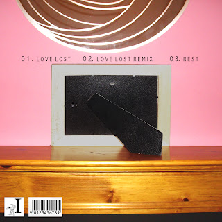
Here is the final artwork for Front, Back, Inside and CD. We changed the colour on audience feedback to something more plain, since people suggested that bright pink didn't really suit the Indie genre or our band, but hopefully still original. The colour we've used suits the informal, "home" feel of our video and uses the plain convention that we found in our CD research, but avoids the stereotypical black/white.
On the inside sections we've used the same conventions and tried to capture the spirit of our video and band in the photos on the left - a mixture of fun and more serious.
Tuesday, 11 January 2011
The Final Video
It's done! We're pretty happy with how it's turned out, and all that's left to do now is the evaluation and to finish off the website and cd artwork, as well as do a comparison with the official video (which, as we mentioned at the start of the project, was released so recently that we didn't find out until too late).
Enjoy!
Enjoy!
Labels:
Music Video
Friday, 7 January 2011
CD cover
The Cd cover is almost complete the only thing we need now is photos of the band to fit inside the photo frames.
Subscribe to:
Comments (Atom)


